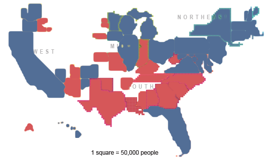
Is this your mental picture of the last national election?
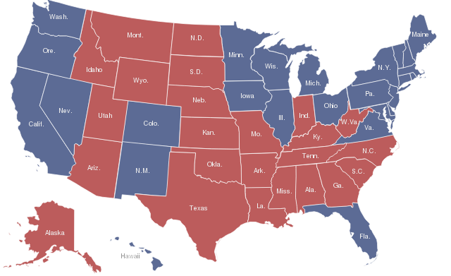
Or was it more like this - the 'usual' view on TV, Web, etc.
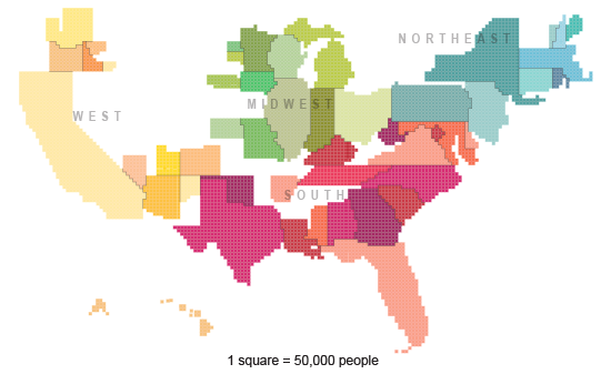
This is a new cartogram from the US Census Dept, showing the size and overall distribution of the U.S. population as of 2010. The top image is just a quick recolor.
The usual view doesn't represent the facts very well. It lets geography express population. Big blotches of RED (i'm lookin' at you, Wyoming) and BLUE (Nevada, not so much) are telling us a very misleading story. If a national publication put exaggerations of this sort into words and numbers, they'd be pounced on by fact-checkers. But, for the moment, it's still acceptable to mis-state visually.
The recolored cartogram tells quite a different story from the default geographical fill-in at the top, doesn't it? The usual view says to your eye "RED WON!" - there are more red pixels than blue, because of geography. (Alaska to scale would really tilt it.) But of course we're supposed ignore that, tap Wikipedia and run 50 quick population-to-land-mass calculations in our head and ignore what we see. Sure.
The colored cartogram feels more like that fatal point in Risk where you really wish you hadn't gone strategically Fortress 'Merica.
Does stuff like this matter, or is it a nice-to-have? I wrestle with this, particularly when we help clients with presentations. They've got the full set of power-tools (-point), but they're frequently torn between making sense and making an impression. Bad facts and calculations propagate themselves WAY too easily in visual forms. ("Hey, that's a great visual, let's re-use it in this other deck.")
What do you think? Should there be a grading scale, or a code of ethics, for truthfulness in visualization?
--md


