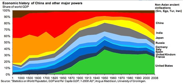
I'm not sure whether to type "love it" or "hate it." It's fascinating to see a huge topic addressed in an itty-bitty chart. Look it over a bit.
What's not to love? A few things, at least from my point of view. The complete rainbow of colors - including the opposing-primaries for China and the US - aren't really necessary. It would probably read just fine if it were monochromatic - it's not particularly hard to follow the consistent stack. I think I'd run really light grey % lines across the whole thing - eyeballing whether the US (for example) was above or below 40% in 1960 is a little tricky.
The now-it's-logarithmic, now-it's arbitrary historical scale is a bit dodgy. 1900-1913 get the same horizontal allocation as 1913-1940. Of course since there weren't any major economic upheavals during that period, it's probably OK. This may well have been driven by available data, but still...
I'm surprised at the UK's relatively small GDP proportion during the sun-never-sets phase. I'd have expected more, frankly, and it makes me wonder about the definition and figures of GDP. Was the US really a bigger player in 1870 than Olde England?
All that said - read the article. Or give the chart to a middle-school kid and tell 'em to explain some of the big spiky change-points. They may well remember this one garish chart better than their whole textbook.
-md
PS anyone in the Netherlands, Finland, Brazil, etc feeling a bit slighted?

