Simple Rule: Big Things Big

Much of the "Chief Explainer" job is editorial - by which I mean, prioritizing, clarifying and focusing the efforts of others.  When you know a subject well, prioritizing is paradoxically more difficult.  Frequently, those 'others' are our clients.  Of course, they know their business or technology or cause FAR better than we do.  That's precisely their challenge.  

One nearly-unconscious rule for me in explaining is, as the title says, "make the big things big."  By that I mean, simply make the most important things the most visible/memorable elements in your communication.   Measure them.  Color them.  Check their font size.  If they're not the biggest (or most saturated, or most-contrasted, or most 'foreground') things on the screen, there should be a VERY good reason.  

As an avid fly fisherman, I was delighted to run across this series of river maps which depict major North American river systems using the conventions of transit system visuals (established with the original London Underground map by Harry Beck).

Columbia River System by http://cargocollective.com/somethingaboutmaps

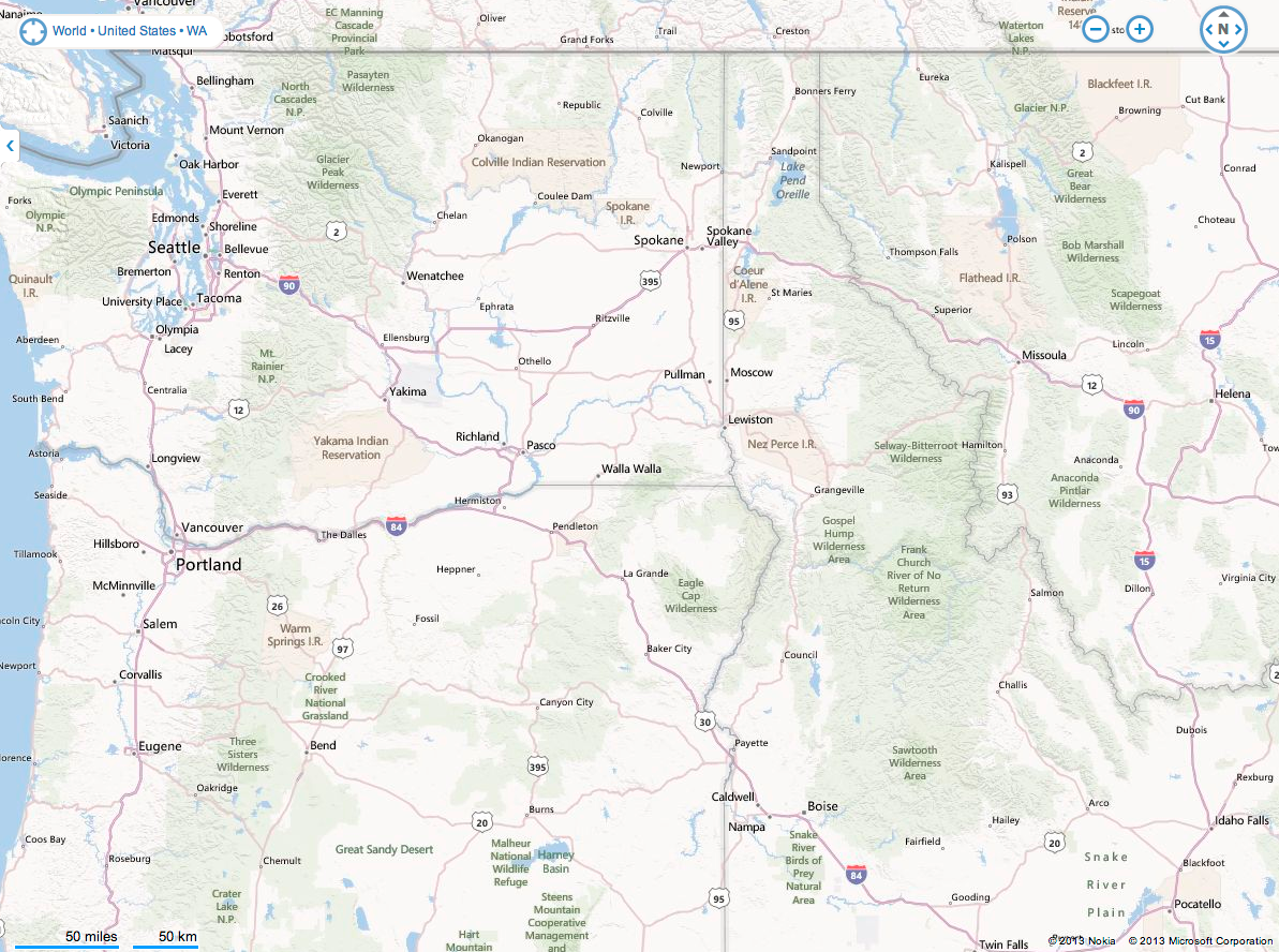
Click that and enjoy it.  Then try to pick out river relationships in this, which is roughly the same set of watersheds. 

Bing map view http://binged.it/16pOqRF

Bing map view http://binged.it/16pOqRF

Yes, the Bing map is depicting a broader set of entities.  The goals are different, so the design choices are different. That's the point, right? (FWIW, I found the Bing design  better than Google's design at helping me see rivers.) 

The Cargo Collective river transit maps take the 'big things big' further.  They sacrifice things like state geographies and terrain elevations to make the structural relationships of the rivers clear. 

I was once on a stream above the Okanogan river - near "Omak" on the transit map, doing some early-morning teasing for trout.  I about dropped the rod when I saw a massive fish - at least two feet long - shoot up the pool and past me.  It was most likely a steelhead (an anadramous trout - one that ran off to sea, returning with tattoos and a procreative imperative). The truly startling thing was how FAST the fish moved.

Trace from Omak to the Pacific on the transit map, and envision what that fish went through to be back on that stream - with enough energy left to go like a torpedo. Marvelous!  (And pretty marvelous that a simple-looking map could give you the framework for that mental narrative, which is a whole other point to be made later.) 

Maybe it's time to go fishing. Keep the big things big.

--md


The Politics of Measures

We had the opportunity to work with a bunch of really passionate health education experts from the Departments of Health in 10 different US States.  It was fascinating, really. (The project as a whole probably deserves an essay, but that would be a lot longer than a blog post.)  Over days of conf calls, we moved the target from "health literacy" to "health knowledge that actually matters."  In the case of stroke, for example, we decided that knowing that someone might be having a stroke, mattered a lot more than understanding the underlying causes of stroke.

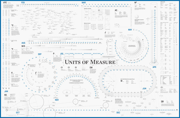
One of the pitched battles that I lost came to mind when I ran across this very cool "Units of Measure" poster.  (Yeah, I want this hanging on the office wall!) 

The battle was over blood pressure measurements. 

Do you know your most recent BP measurements?  Hint, it's one number over another number.  Honestly, I couldn't remember mine when we got to that topic - other than "good."   

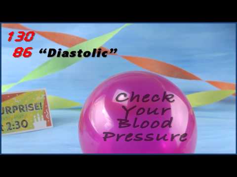
Do you know what each measure represents?  Here's a handy explanation video that (we hope) makes that more memorable. 

The unit of measure for blood pressure is millimeters of mercury.  No, we don't tend to have mercury getting pushed up a glass tube any more, but the digital readout on your blood pressure monitor is using the same terms.  

What I argued - unsuccessfully - was that the measures are arbitrary, and (consequently) difficult to understand.  Systolic ranges from 90 to 180, diastolic from 60 to 110; systolic above 140 is BAD, diastolic above 90 is BAD.  Argh!  I know it's just a few numbers, I know it's important, but even a simple table of those numbers just doesn't stick.  My proposed solution - combine the numbers and try to make that one combined number stick in people's heads.  Combined measure of bad is 230.

If you watch the video, you'll see the time for the surprise party is 2:30. We had a line in the voiceover, something like "If it's past 2:30, it's time to see your doctor!"  The health experts argued that the BP system of measure is too well-established and too well-understood. They were the client, OK, we won't talk about combined measures. 

I still don't agree.  I remembered 2:30 but I had to go look up the stupid arbitrary number ranges to write this post! :-)

Something as simple as a unit of measure has a powerful long-term effect - the story about horse's asses and the space shuttle is worth looking up.   I hope that over time we'll be more deliberate about selecting new measures with a bias toward learnability and recollection - "human-scaling" them, if you will.  If you're defining measures for a business, include "can anyone understand these and/or remember them" in your set of criteria.

Is that minutia? I don't think so.  In the case of health literacy, it really is life-or-death important.   When we're making decisions, the things we know & understand are going to trump the answers we could get from search engines - at least, I'd like to think that's the case. It's certainly the bias we bring to our work.

Enough.  Go check your blood pressure!   If it's past 2:30...

--md

Dot Grid Maps: Simultaneous Comparisons Made Easy

Jacques Bertin is a pioneering figure in visual communication. It says something about how relatively young this field is to note that his most influential book - Semiology of Graphics - was published less than fifty years ago.   We've been communicating visually for a bit longer than that, but not that many people were thinking about the topic methodically.  As someone who loves & appreciates maps, I'm not surprised that Bertin was a cartographer.  Map guys established many of the principles of the field, and still create some of the best work.  

So, let me pick on the color-coded-US-map once again to make a point.  A US map, divided by state boundaries, represents geography - right? If we fill in the states with colors to show something else - votes, populace, incidents of Scottish Terriers, whatever - we run into a conflict.  Wyoming doesn't have that many Scottish Terriers (I think), but Wyoming is big, so we won't really understand the Scottish Terrier population accurately. 

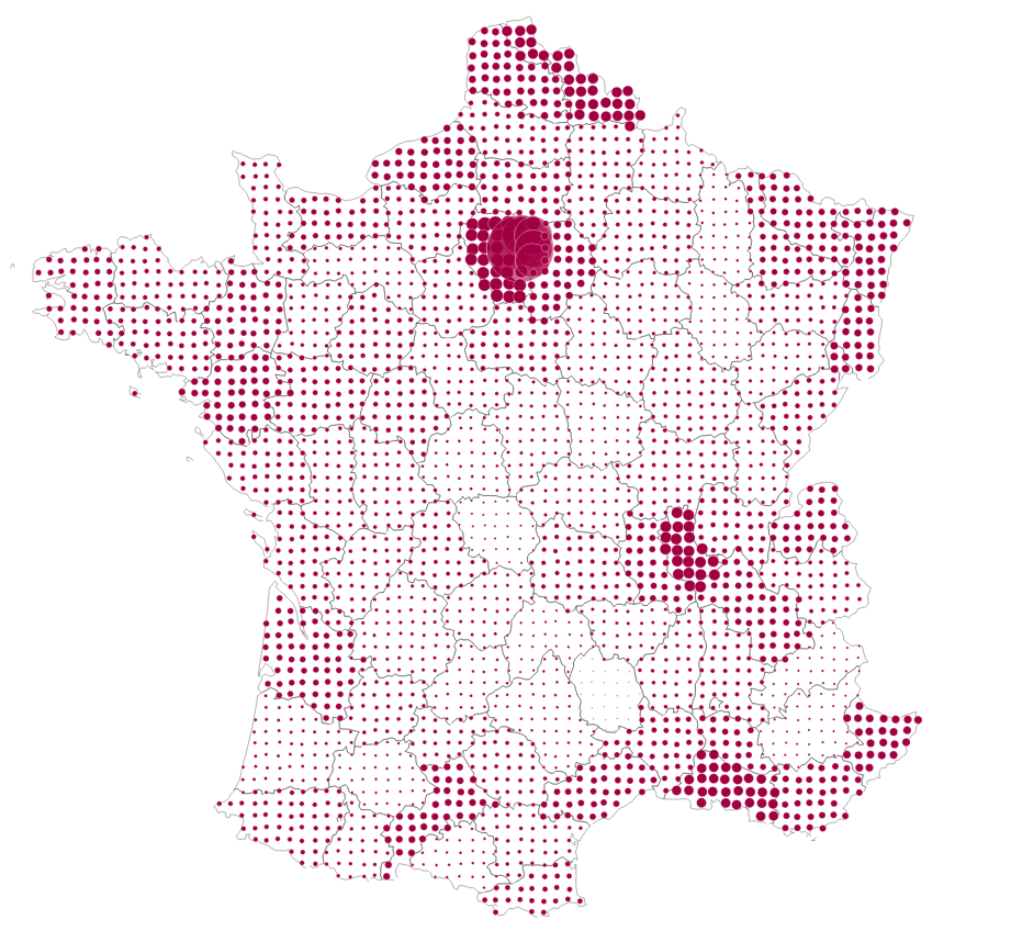
Bertin recognized the problem with cloropleth visuals (shaded/color-coded maps), and suggested an alternative called the Dot Grid.  It's quite elegant.

What nation does this map represent?  

What do the dots represent? 

You probably knew both answers without labels, and I'll bet you commented on the population of the capitol as well. 

"Elegance is a synonym for beautiful that has come to acquire the additional connotations of unusual effectiveness and simplicity."

Thanks, anonymous Wikipedia author. It's the right word for this technique.  It is simple, but it enables a reader to make sense of two unrelated things simultaneously, resulting in additional knowledge.  That's a pretty powerful thing.  Yes, a priori knowledge plays a role - if you ignored geography class you might have no clue what country that is.  (Here's hoping that we have a much more geographically literate populace in the years to come, thanks to Google Earth et al.)  

I particularly appreciate the no-labels-required aspect of the technique.  There's no key explaining the dot size - you don't need it. You're perfectly able to compare sizes, almost instantly, and with a high degree of accuracy.   You can make comparisons between 94 different double-coded (area + populace) entities, or focus in on a subset with a sense of context to make further meaning.   

All that from a bunch of dots.  Isn't that cool! 

--md

The Last Sense

Put the visual brain on hold for a second.  Try to conjure up the smell of a Crayon box. 

Something missing from the media landscape?  Yeah - not that there weren't experiments in Smell-o-vision and (if memory serves) something similar back in the PC era - not to mention this gaming-era smell making device.  (David Belasco made smell part of his naturalistic theatre productions in the early 20th century.)  

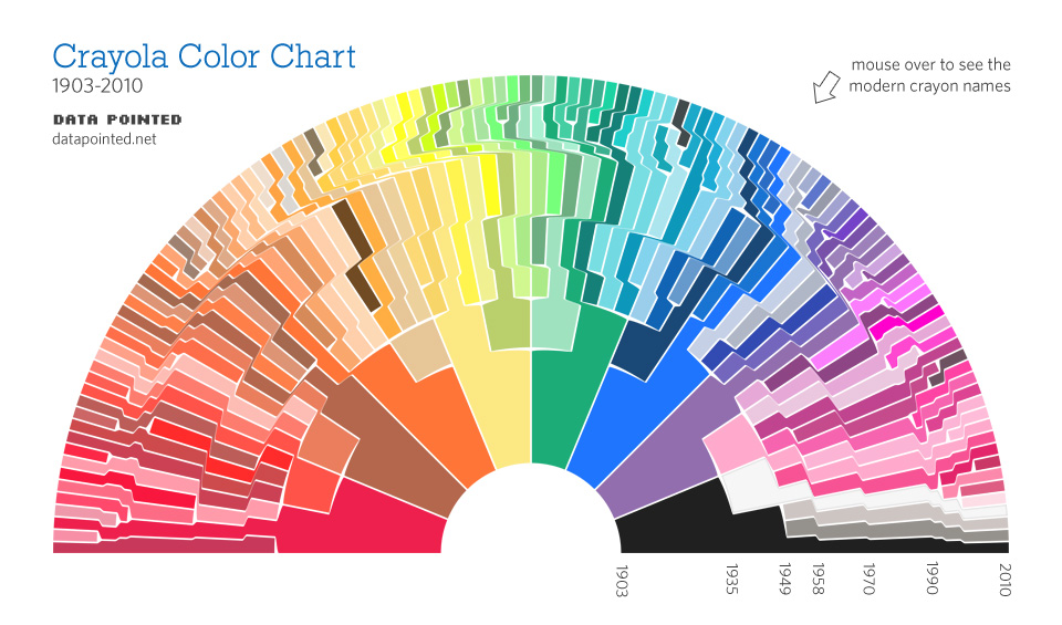
It says something about the power of that sense that this fascinating chart of Crayola color evolution evoked smell first. (Click visual for large version; here for blog details.) 

IBM, not to be outdone, has opined that as the planet gets smarter, computers will (also) gain the sense of smell. 

Makes logical sense. 

For all that, a box of Crayons still makes one heckuva time machine. Just open it & sniff, and see if you don't end up back in school. Mom, can I get the big box of 64, please? 

--md


What Makes An Infographic Cool: Beer!

Beer is cool.

So is an infographic on beer cool? 

I think this one is cool:

But, unfortunately for the guys at popchartlab

  • First Rule of Cool: “The act of discovering what’s cool causes cool to move on.”

Dang, if I think this is cool, it must not be, because

  • Second Rule of Cool: “Cool cannot be manufactured, only observed.”

plus

  • Third Rule de Cool: “...can only be observed by those who are themselves cool.”  *

I discovered this, and I’m not cool. (Never have been. Never will be.) So, Popchartlab guys, I apologize for thinking The World of Beer infographic is cool, and killing you on #1 and #3.  But leaving aside my fondness for the subject matter, here’s why it’s cool.

  1. Show More In Less.

This shows me much more about beer varieties on one page than could be written in one page.  It makes effective use of a few visual-communications principles - connection, clustering, scale and typography - to help me traverse, relate and generally make sense of 300+ different beers and about 100 varieties. That’s thousands of relationships in one page; if they’d have typed all that, I’d have gone out for a sample instead.

Many of the awful constructs that set out to be “infographics” manage to say in one large page what could be said in one short paragraph. They’re long on decoration and stylistic flourish, short on substance. Not cool.

  1. Structure Is Chancellor**

The visual design here is driven by the structure of the subject matter.  They didn’t draw a bunch of circles and lines and say “Hey, let’s fill these in with beer varieties!”.  Likewise, the aesthetic choices - color, line, typography for example - serve the subject matter instead of overriding it.  (The quasi-Victorian look underlines the historical longevity of beer varieties, for example.)  It’s also worth pointing out that visualization is more effective with this structure than language.  Describing all of these formal relationships in English (or your language of choice) would be ponderous and far, far longer. 

Run-of-the-mall infographics tend to impose style on structure. Not cool.

  1. The Goal Is Understanding

A very old-fashioned criterion for cool, admittedly, but absolutely key IMHO.  I happen to like Arrogant Bastard Ale (top-left); understanding that it’s an American Strong Ale, which is an offshoot of Strong Pale Ale, in the flick of an eye...is cool. It delivers on that criterion called “utility value” in the intellectual-property world - ‘does something useful’ - because it helps me understand more, more quickly - at least up to the limits of consumption in this case. (Will I remember all of it? No. Is it in Evernote for future brewpub visits? Yes.)

Not-cool infographics tend to aim at goals external to understanding of the subject matter - goals like SEO ranking, keyword packing, and branding.  These are fine business goals, but pretending to inform me is an Arrogant Bastard move, really. It’s a trick of the form - “look at our cool infographic” masking “look at us.”  It’s interrupt advertising masquerading as content marketing and that’s not cool.

Infographics (a portmanteau nobody should carry) tend to split along data-rich and decoration-rich. The World of Beer isn’t a Big Data set - but it’s a respectably difficult subject to tackle.  There’s some real design integrity to this piece - no CGI trickery or typographical back-flips because that would be wrong for the subject. 

It’s a personal bias, to be sure, but I find the coolest infographics tend to have that kind of restraint and class. They aim more at connecting me to the subject matter than the subject maker.  That’s me; may not be you.  Cool, like beer, is a matter of taste.

* Malcolm Gladwell, The Coolhunt, New Yorker, 1997.

** There are too many “content is king, ______ is queen” tropes, you don’t need another.   Where content is king, structure is the power behind the throne.

--md


Guest post written for Randy at

Cool Infographics


Language Standards In Media

I buy a LOT of books - paper and ebooks.  I've noticed that the quality of the writing - at least in the fiction category - is lower in ebooks. Yes, the barrier to entry ("getting published") has changed.  So has the available toolset (e.g. Grammarly) to help self-publishers keep quality up - which, apparently, they ignore.

It leaves me wondering whether reactions to things like spelling and grammar are personal anachronisms. Does it matter if someone mis-spells a word, if you know what they meant?  Is grammatical structure worth the effort?  Does it matter in media?

I really, really wanted to like this video: 

But I couldn't get past this kind of thing:  

0:26 "Typography it's words and sentences".  
2:02 "To the more substancial"

Teeny, tiny things.  Nits in a very nicely-crafted video.  Should I care?

(Yes, the designer is French, but the choice of language was his...) 

Media tools like After Effects and Motion tend to lack things like spelling and grammar checking - it feels like going back to a stick shift.   It's easy to miss typos if you're used to the little red squiggle.  But, geez, if you're going to produce something this cool... 

--md
(dinosaur)