OVERLOAD

The Technology Alliance Group invited me to talk about information overload last week.  There's a great McLuhan quote - perhaps apocryphal - something like "We don't know who discovered water, but we're pretty sure it wasn't the fish."  Asking just about anyone about information overload is pretty much like asking a fish about water - me included.   However...having thought about this quite a bit, I think it's a bigger issue than we realize.

Ask yourself this, if you're over 30.  Has your reading changed?  I don't mean what you read - that, certainly - but HOW you read. My sense is that I skim & scan much, much more than I used to.  (And "avid reader" doesn't begin to describe my appetite for reading.)

The issue isn't reading and reading habits - it's coping.  Here's the problem, in a visual of course:

The Library of Congress adds about 11,000 volumes per day - total to date, 32 million.

Clive's estimate is the equivalent of 520 million books.

Result:  4,727-to-1. 

What we used to think of as formal knowledge - the stuff that goes in library - is outweighed thousands-fold by the social stuff.  But wait, it gets more interesting.

LOC has 32 million volumes.  Founded in 1815 - 198 years ago.  Multiply by 365 to get 442 volumes per day, on average.  But the current rate is 11,000 per day.  Has the rate of acquisition of formal knowledge gone up?  Sure - dramatically.

I think we're creating a problem that we're not quite culturally ready to 'fess up to (except Ray Kurzweil & his fans.)  Overload?  The word doesn't really capture the issue, does it.  It has a sense of voluntary taking-on-a-bit-much, with a smidge of pride.  We're not "overloaded" - we are incapable of handling this much information in the ways we've handled information for the past 500 years or so.

If you deal with information and knowledge in your profession, you're rightfully proud of both the knowledge you've got, and your skill at adding to it. Saying "I can't keep up" doesn't really square with that very easily. Honestly, though - you're not "keeping up."  I'm not "keeping up."  

The techno-centric response is to point at the knowledge tools we've added - search engines, software, "big data" tools, blah blah blah.  No argument from me, take away my browser and suddenly I'm not half the borg I used to be.  But I don't think my capacity for knowledge acquisition - for adding to what I know and associating it with what I knew - is 4,000 times greater than Grandpa had. It's probably the same;  Jared Diamond says something to that effect in Guns, Germs & Steel as I recall - the guy whose life depends on plants and grass can make a huge number of distinctions, where an idiot like me just sees grass.

Is this a waste of time in the face of the bitflood? Yes - and no. One of the reasons I like working with visual and narrative communication is that it often works when words don't.  It's not a panacea - I don't know about you, but I've started to "read" infographics with the same impatient handling reserved for email.  But it's at least an attempt to reframe communication challenges in light of this big contextual overload issue. 

The rise of "design" strikes me as a response to all this, in a sense.  That's another post.  I have stuff to read ;-)

--md

Data Structure Heatmaps With Excel

I put up a casual post about a data visualization project a while back. Apparently a lot of people are interested in (or fighting with?) Excel for heatmaps, because it keeps getting a LOT of traffic.  Maybe I should capture that traffic and create a heatmap?  Humor.. 

The same project for the client-who-must-not-be-named continues.  They LOVE heat maps.  Every data set, they want a heat map. I've said over and over that it's only relevant when we're making a consistent single comparison, but OK, you wanna heatmap...

I was looking at a very high-level summary, showing pricing across 8 product lines, with 30 varying tiers, for 6 different regions.   (mumble mumble 30 x 6 = 180).  You wanna heatmap, we gotta heatmap (Select Range - Conditional Formatting - Color Scales). I suggest clicking that to see a larger version.

There are really two heatmaps here - the pricing in C:H, and a mirrored % set in J:O.  Just look at the macro-level color pattern - identical, right?

It bugged me a bit, though, because the range is just nuts - from $73.30 to $1,767.24.   Lots of stuff in the yellow middle.  It bugged me because the groups aren't necessarily interchangable, where the tiers might be.

So I tried something a little more elaborate: 

The punchline here, in terms of visual communication, is that this is the same data. If you can, look back and forth at the small versions of these pictures. It's a really different pattern. Wow, those Region 3 & Region 4 guys are good (green). What the heck is going on with Group E in Region 2, and Group F in Region 5. And so on, and so on.

My contention is, there's no way in heck to spot those comparisons by looking at the numbers. It's just not going to happen. Your brain isn't going to hang on to the relationships between 180 different numbers.

OK - quickly - HOW this was done with Conditional Formatting rules. First one - the whole range is a single comparison ("Rule"):

To make the second one - group-by-group - required selecting just the range for a group (e.g. C3:H3 for the first group), and applying conditional formatting for that range. Lather, rinse, repeat.

You can see the list of separate rules here:

Now, I suppose we could have an interesting argument about whether this is a good approach.  The color-coding between Groups is not absolutely consistent. $300 may come up RED in one group, and GREEN in another, and you aren't going to spot the really high prices for the set as a whole, or have a sense for which region or group is relatively low-priced or relatively high-priced. 

Well...yeah, that's why we did both heat maps, but let's leave that aside for a moment. 

The visual-communications question decision/question should be, does one of these color-coding approaches reveal more meaning in the data?  I think the second one does.

It's pretty simple - axiomatic, even.  Because we used additional structure in the data (the Group blocks), we revealed more about the data.  The one-big-block heatmap didn't access that structure, so of course it had nothing to say (visually) about that dimension of the data. 

FWIW I wouldn't have used the color-coding for the different groups (Columns A:B).  It detracts from the meaningful color-coding of the data.  Others' presentation decisions went into that choice. Oh well.

One non-obvious note - spending a little time getting consistent-sized columns, and finessing the gridlines, helps make this a more accurate mechanism for communication. 

--md

PS auto-correct wants "heatmap" to be "heat map."  I don't buy it. Thoughts?

Story Transcends

ทรูมูฟ เอช เชื่อเสมอว่า "การให้ คือการสื่อสารที่ดีที่สุด" โดยเราสื่อสารผ่านภาพยนตร์โฆษณาทางโทรทัศน์ เรื่องราวในภาพยนตร์โฆษณาเรื่องนี้ สะท้อนแนวคิดของแบรนด์ ทรูมูฟ เอช ที่เชื่อว่า...การให้โดยไม่หวังผลตอบแทนเป็นจุดเริ่มต้นของการให้ที่แท้จริง ทั้งนี้เค้าโครงเรื่องได้รับแรงบัลดาลใจ มาจากเรื่องราวทางสื่อสังคมออนไลน์ เล่าถึงเรื่องราวของการให้ที่ไม่หวังผลตอบแทน แต่ได้รับบางสิ่งตอบแทนราวปาฏิหาริย์ เพราะการให้คือ คือการสื่อสารที่ดีที่สุด แม้ไม่มีคำพูดสักคำ แต่กลับเป็นการสื่อสารที่ทรงพลังที่สุด ทรูมูฟ เอช เชื่อในพลังของการให้โดยไม่หวังผลตอบแทน และจึงมุ่งมั่นที่จะพัฒนาเทคโนโลยีการสื่อสารใหม่ๆ ให้กับคนไทย เพื่อสร้างโอกาสและพัฒนาคุณภาพชีวิตคนไทย ให้ทุกๆการสื่อสาร เชื่อมต่อถึงกันอย่างไม่มีที่สิ้นสุด ชีวิตอิสระ ชีวิตทรูมูฟ เอช

Did you follow this?

Me too. 

I don't speak Thai either. 

Doesn't matter, does it. 

"A fellow-feeling makes one wondrous kind." 
   David Garrick:  Prologue written for his last performance, June 10, 1776.

--md


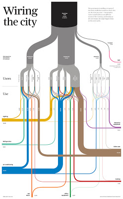
Terrific Sankey Diagram from South China Post

I'm becoming more and more a fan of Sankey diagrams.  This one shows how electricity is used in Hong Kong.  It's excellent - click to the page and click again for a legible version.

What makes it terrific? Sounds dumb, but the fact that it's so easy to follow and understand.  Line thickness means something, color means something, and connection/path/destination mean something - and comparing between them is so easy it's unconscious.

Imagine a written report on energy use in Hong Kong.  Think it would fit on a single page, or (more likely) 50-100 pages of prose with a few number tables. 

Imagine a group faced with deciding energy policy, or rates, or infrastructure.  Would having this diagram on the table or the wall help them make better, faster decisions? Would the diagram be regarded as more or less "serious and substantive" as the hypothetical report? Is that an accurate reflection of value, or a cultural bias?   

A client recently rejected a set of Sankey diagrams we'd worked up because they were "too curvy."  Methinks that was more about their culture than the curves, but you can't please all of the people all of the time.  Come to think of it, that proverb would make a good Sankey diagram :-) 

--md

Not Cool Infographic

Ordinarily I can't be bothered to write negative critique stuff - in private or in a public blog. But when this "infographic" came across my Zite feed...well, let me be substantive so the critique has some value.  If you're going to choose a style and a form, do so because it's more effective at communicating.

Here are the facts, ma'am. 

  • In the last 3 years, cell phone traffic has increased 5000%
  • Mobile ad spending was expected to grow 80% in 2012 and reach $2.6 Billion.
  • Mobile traffic is expected to increase 18 fold by 2016.
  • By 2014 there will be more mobile users than desktop and laptop users globally.
  • 50% of smartphone users watch video on their mobile device.
  • 75% of US smartphone owners watch video on their smartphones, and 26% do so every day.
  • 92% of mobile video viewers share videos with others.
  • Online videos account for half of all mobile traffic.

Is it "cell phone" or "mobile" or "smartphone" ?  Oh, wait - if you pull a bunch of random stats from other people and attribute them (however illegibly), you're not supposed to monkey with their choice of terms.  

Do I care what was expected in 2012, now that we're in 2013? Seriously?  You can't be bothered to find the most recent data, or projections into the future.?

Then there's smartphone video viewing.  Rossiter says 50%, Google says 75%.  Are we supposed to pick which one to believe? 

Leaving those citation nits aside, it's just the sheer waste of space and time that irks me about this.  8 sparse bullets become a longform-scrolling blue nightmare. No comparison or relationship between data. No insights.  Just the Smurfs edition of Illustrator coughing up random decoration and whitespace.  Tell me, please, why this is better.  I don't see it. Grrr!

Dear clients - if we ever do something this ineffectual, please show us the door. 

--md


Online Video Goes Mobile
by Wyzowl.
Explore more infographics like this one on the web's largest information design community - Visually.

YouTube: 2nd Largest Search Engine

Do you consider video "serious content"?  Your shut-in cousin might send you great cat videos, but are you going to go searching for them?  The volume of searches on YouTube seem to me to say that something is happenin' here.  Search is an act of volition - you have to be looking, and you have to have at least something in mind to type in the search box.  

Is your company represented on YouTube?  If 1 out of 2 people on the Internet are on YouTube...maybe you should consider doing something. 

--md

Infographic by Mushroom Networks