Much of the "Chief Explainer" job is editorial - by which I mean, prioritizing, clarifying and focusing the efforts of others. When you know a subject well, prioritizing is paradoxically more difficult. Frequently, those 'others' are our clients. Of course, they know their business or technology or cause FAR better than we do. That's precisely their challenge.
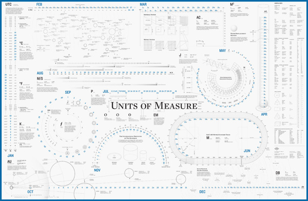
One nearly-unconscious rule for me in explaining is, as the title says, "make the big things big." By that I mean, simply make the most important things the most visible/memorable elements in your communication. Measure them. Color them. Check their font size. If they're not the biggest (or most saturated, or most-contrasted, or most 'foreground') things on the screen, there should be a VERY good reason.
As an avid fly fisherman, I was delighted to run across this series of river maps which depict major North American river systems using the conventions of transit system visuals (established with the original London Underground map by Harry Beck).
Columbia River System by http://cargocollective.com/somethingaboutmaps
Click that and enjoy it. Then try to pick out river relationships in this, which is roughly the same set of watersheds.
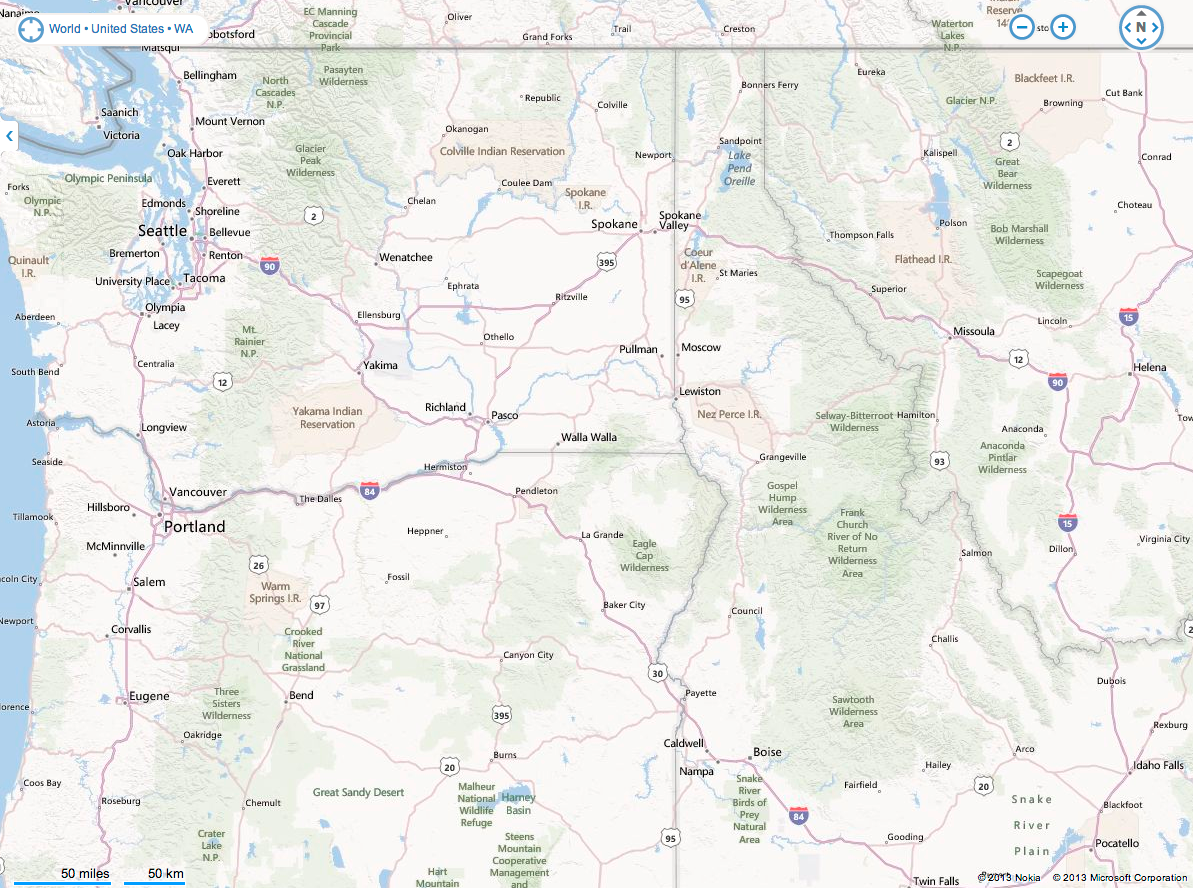
Bing map view http://binged.it/16pOqRF
Yes, the Bing map is depicting a broader set of entities. The goals are different, so the design choices are different. That's the point, right? (FWIW, I found the Bing design better than Google's design at helping me see rivers.)
The Cargo Collective river transit maps take the 'big things big' further. They sacrifice things like state geographies and terrain elevations to make the structural relationships of the rivers clear.
I was once on a stream above the Okanogan river - near "Omak" on the transit map, doing some early-morning teasing for trout. I about dropped the rod when I saw a massive fish - at least two feet long - shoot up the pool and past me. It was most likely a steelhead (an anadramous trout - one that ran off to sea, returning with tattoos and a procreative imperative). The truly startling thing was how FAST the fish moved.
Trace from Omak to the Pacific on the transit map, and envision what that fish went through to be back on that stream - with enough energy left to go like a torpedo. Marvelous! (And pretty marvelous that a simple-looking map could give you the framework for that mental narrative, which is a whole other point to be made later.)
Maybe it's time to go fishing. Keep the big things big.
--md