
I'm becoming more and more a fan of Sankey diagrams. This one shows how electricity is used in Hong Kong. It's excellent - click to the page and click again for a legible version.
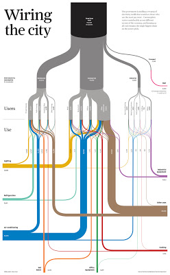
What makes it terrific? Sounds dumb, but the fact that it's so easy to follow and understand. Line thickness means something, color means something, and connection/path/destination mean something - and comparing between them is so easy it's unconscious.
Imagine a written report on energy use in Hong Kong. Think it would fit on a single page, or (more likely) 50-100 pages of prose with a few number tables.
Imagine a group faced with deciding energy policy, or rates, or infrastructure. Would having this diagram on the table or the wall help them make better, faster decisions? Would the diagram be regarded as more or less "serious and substantive" as the hypothetical report? Is that an accurate reflection of value, or a cultural bias?
A client recently rejected a set of Sankey diagrams we'd worked up because they were "too curvy." Methinks that was more about their culture than the curves, but you can't please all of the people all of the time. Come to think of it, that proverb would make a good Sankey diagram :-)
--md