Here’s what’s going to happen.
The “President” and his minions will start trotting out a MAP. The map will show the counties, color-coded. They’ll use this to talk about the fact that things are OK.
MAPS SHOW LAND NOT PEOPLE
Showing a land-mass map to represent human-scale statistics is a lie. The eyes of viewers are receiving a verifiable misrepresentation. We’re accustomed to seeing geographical representations, so we brush it off. It’s “convenient.”
Lying about facts is illegal.
This lie is going to cost lives.
I encourage every responsible news organization to refrain from repeating the lie. All data visuals representing the scale of infections should show THE SCALE OF INFECTIONS, not the scale of the land where infections happen to be.
Some time later when we’re mopping up, let’s put all the heartless asses who used these lies in jail.
]]>Last fall Facebook locked out video sharing; video content from other sources (YouTube, Vimeo, Wistia, Vidyard, etc) stopped playing within Facebook. Instead, viewers get thumbnail images and off-Facebook website links. The intent is obvious; push viewers to upload video to Facebook instead.
LinkedIn used to be the classy business-grade hotel to Facebook's dorm room, but LinkedIn seems to have succumbed to the same 'you can check out any time you like, but your content can never leave' temptation. LinkedIn no longer plays embedded videos. YouTube, Wistia, Vimeo et al get the same static-thumbnail treatment they receive on Facebook; not video, but a hyperlinked picture. The 'Video' button on the LinkedIn post dialog is just a file-upload.
I expected Facebook to choose the monopolistic route, but I'm surprised that LinkedIn has done the same.
Think about this simply and logically for a second. Say you're a human being with (a) actual friends, (b) Facebook 'friends', and (c) a job, and you have (d) a bit of video footage that you think might interest the people in those groups. 6-8 years ago, you'd have uploaded the video (once) to YouTube, and pasted the YouTube link on each platform. People would watch where they were.
This was a great position for Google (owning YouTube) - YouTube == video for many people. That's somewhat beside the point, though. The real point is that there were open-ish standards for sharing video - YouTube was just one of the platforms, but you could choose others. Business marketers gravitated to Wistia & Vidyard; filmmakers to Vimeo, and so on. They could distribute, manage and control their content, from one place - a single (d), if you will.
Now Facebook and LinkedIn have made a unilateral decision for their users - "no, you HAVE to put your files on our platform, you can't share from anywhere else."
To share that video (d), you upload a separate copy to each platform.
No big deal? I disagree.
Say you've hopped through all the hoops - uploaded to Wistia (so you can email to customers), uploaded to YouTube (hoping for a bit of market share), uploaded to Facebook (because Mark doesn't have enough content) and LinkedIn (business contacts.)
Then you notice a massive, awful typo in the headline. Horrors!
Now you get to re-do all of that - delete each old video, upload the new video to each platform, again. Yeah, that's a scalable, simple way to run things.
Not.
This Balkanization also applies to the data coming back from that video. There's no single dashboard for "who's watching, how much, when" and so on - each of these platforms has a separate copy, with separate stats and reporting. For businesses investing in video content, this is really a massive step backwards.
A close friend of mine runs a terrific conference business, RefComm.com. He created some video content to fill in his customers & prospects on an upcoming event. He won't really know how that content is working for his business across channels - he'll get a different view and different measures from each platform. He's back to Excel as a dashboard.
I don't see how this benefits the users of these platforms. Honestly, I'd love to hear the rationale from either Facebook or LinkedIn. My bet is that the first salvo would be some corporate-speak about "improved user experience." Massive pile of B.S., that; we were all happy enough with the embedded-video experience to drive video traffic through the roof in the last few years.
If they were actually candid, they would say "it's about advertising control." We, the platforms, don't want embedded YouTube videos with ads.
I understand that, but retreating to the old proprietary-formats corner is a dumb solution to the problem.
We had a working detente - your content could play on my platform, and vice versa. Why didn't the platforms hammer out a revision to those content-sharing standards instead of chucking them? YouTube -knew- when a video was playing on Facebook. They could have switched ads off, or arranged revenue sharing, or something else.
Instead, we're back to asking users to copy massive video files multiple times. More duplicate bits on more servers; more duplicate IDs and incompatible data about video.
Some of the users will figure it out - oh, OK, just multiple file copies, got it. Many will throw up their hands at the unnecessary complexity, and just spend more time on one platform. And that's really the end-game goal. The 82-year-old who wants to share vacation footage will - Mark hopes - just stick with Facebook only, because it's simpler. Businesses will stick with LinkedIn (maybe).
Wistia, Vimeo, Vidyard --- well, I know & like a bunch of the people at those companies, and I think they're in for some pain. It's harder to see the place for a video hosting company in this landscape.
The contradiction between stated goals and behavior is stark. Facebook used to be about enabling people to share - now they're nominally about bringing the world closer together. LinkedIn's stated mission is to connect the world's professionals. I fail to see how locking out the most emotional and informative form of content - video - does that in either case.
]]>Yeah, that didn't take long.
Today (3/1/18), Vimeo announced this:
"That's why, if you upgrade your membership, you can now publish videos natively to Facebook and YouTube, right from Vimeo."
In English - put your videos on Vimeo, and Vimeo will put them on Facebook & YouTube for you.
It's a sensible move, and one I expect Wistia, Vidyard and others to follow. It's unavoidable; they can't remain the hub for their customer's video content and leave the massive audiences of Facebook & YouTube out. But it changes their business.
The technical premise of video hosting was video management and delivery on the Internet; the Web, mainly, but in apps and other platforms as well. It's the same basic premise that YouTube aimed at @11 years ago.
But where YouTube - thanks in no small part to the backing of YouTube's owner, Google - achieved breakout consumer success for a decade, the smaller hosting companies grew mainly as services for 'prosumers' (Vimeo's filmmakers), business and marketing. They could add value, though, because they provided end-to-end service; the video you watch on my website thanks to Wistia, is logged & managed by Wistia.
Now the platforms with a critical mass of viewers (Facebook, Google/YouTube - we'll see about Amazon) are calling the shots. It's not enough for Vimeo to offer a fantastic video management / video viewing experience on open Web sites. Too many people spend too much time on those platforms; Vimeo's customers can't skip them just for technical loyalty to open standards.
This move by Vimeo really puts Vimeo in a different business. Yes, they can push the video file to YouTube and Facebook - it's actually not particularly difficult. They're no longer in control of the end-to-end delivery, though. Will Facebook or YouTube push full stats back into Vimeo? Haven't looked, but I'd be surprised. Who controls the embed codes? YouTube and Facebook. Who can push ads or control placement? YouTube and Facebook. And so on; as I said, they're moving into a different business.
I'm not interesting in being the last guy clutching my Betamax; markets and standards move on, and winners take scale. It's not all bad, it's not all good, it just happens. I get that. But it's worth noting that such a thing has happened.
--md
]]>
Do millennials use email?
Adobe's recent consumer-email survey - surprisingly - noted that millennials are obsessed with email. Nearly half of them check their email while still in bed in the morning; more than half check email at least every few hours. (http://bit.ly/AdobeEmail2017)
Why is it important to market to them with email?
Millennials are multi-channel, but email is a frequent and long-term choice. Forbes says "If brands want to use email effectively, they must make sure the content is both helpful and relevant."
What advice do you have for email marketing to them?
Use visuals, like video & GIFs! A recent Harris poll showed millennials have a 2-to-1 preference for visual communications, compared to Boomers. 70% of poll respondents said they use visuals in their own communication.
Will it work?
Done personally and well, yes; done frequently and poorly, worse than no. While millennials are more excited to check their email (Adobe Slide 19), one-third say they are most annoyed by irrelevant email.
As a parent of 2 millennials, I consciously choose channels & media based on purpose when communicating with them. Email is NOT the act-fast channel; that's text. But rich content - like videos or visuals - is more navigable in email, even on a smartphone. (While mine use their smartphones for many things, they haven't abandoned their notebook computers by any stretch.)
--md
]]>
What impact do you think AI will have on marketing strategy in
2018?
2018 kayak & lifejacket sales will skyrocket as marketing departments paddle through floods of hype about AI in marketing.
A few large companies with coherent data strategies will have a few ah-hah moments of AI-guided success; the smart ones won't say a word about it.
The real AI-in-marketing action in 2018 will be lab work; wise CMOs will watch, listen, research and learn, but hold off on large investments.
What impact do you think AI will have on marketing in the longer term (5-10 years)?
Dominant players will become still more dominant; absent civil or legislative backlash, data-begets-data and AI cost/scale advantages will transform marketing (back) into a service companies buy, rather than a function they perform - from Mad Max back to Mad Men.
OC (Outside China) Facebook, Google and Amazon will split most consumers; Microsoft will mount a serious challenge to Amazon in B2B marketing as LinkedIn blue fades into Azure.
If adolescence doesn't blossom Siri to She, Apple will niche out; persona will become the new design. Attention and permission will become dual-mediated; my (personal AI) assistant will talk with your (marketing AI) assistant.
What kinds of skills and insight/intelligence will marketing professionals need in the future to work with AI?
Marketing pros and orgs will require a dual-minded balance of IQ and EQ. AI will ratchet up the pace of the pace of change again; it will feel like the singularity. But people - not algorithms - will still be the key decision point, and "feel" will still drive their decision; design, media and messaging out of sync with the consumer's point of view will fail.
Effective marketing organizations will figure out the balance of process and culture to pair soft and hard skills. Above all, the ability to learn, and to integrate new knowledge and existing skills, will be vital both personally and professionally.
--md
Painting the Montana and Wyoming land mass red, or those of Oregon and Washington blue, is a visual distortion equivalent to giving them 2x-8x their actual number of people (or electoral votes). Likewise, coloring in Massachusetts whatever you shade you like understates their numbers at least 2x.
I've had smart people say "Oh, but I know that Wyoming doesn't have that many people." Bah. Baloney. One, nobody does that math in their head except Josh on the West Wing (and he's a fictional character like Wyoming's extra electors.) Two, that's a rational response - your limbic system already went into a panic over all the red (or all the blue) that's on the screen lying to you about the race.

This is just one solution - not nearly as elegant as the NY Times rectangle map described in this video, but this one is free. (Here's the Illustrator file - someone send it to CNN please.)
Thanks to Vox for a great video on the issue.
These issues are too important for such poor communication; a journalist making the same distortions with numbers would be called on the carpet. Visuals are processed 60,000 times faster than words - people get them first & faster, and if they read at all, will likely be interpreting what they read based on what they've already concluded from the visuals.
See earlier blog post. Pity nothing's changed.
]]>A customer wrote me late last night to say "hey, I cancelled and you're still charging me." I looked up the records...nope...sent him the screen shot and asked him to send transaction details so I could investigate. He wrote back to say "Ooops, no, it wasn't you." We both agreed that keeping track of these seemingly miniscule subscriptions is a real challenge for small-to-medium businesses.
OK - fast forward about 12 hours. I got a call out of the blue from Adobe.
"We understand you're not happy with your Team subscription."
I explained the situation; they resolved it. (Team subscription cancelled, replaced with the 1 individual seat we need.)
Was that driven by the support interaction? The original blog post below? "Reputation management" monitoring? All of the above? Doesn't matter, really. My hat's off to Adobe for acting, regardless of what triggered the action. They could have taken the neener-neener contract defense, and as I said...my fault for not monitoring dates/terms.
Adobe did the right thing for us. I also think they did the right thing for Adobe. Elephants have long memories; I still avoid one of the major US air carriers because of a cranky flight attendant @25 years ago. But I'll happily trumpet my pleasure at Adobe's approach (elephant joke there...) and continue doing business with them. I like the products, yeah, but liking the company is much better karma all around.
Adobe gets that "...as a service" ends with "service." Kudos.
ORIGINAL POST
I saw a headline recently that basically said Adobe revenue has gone up with their shift to a subscription model. I think Creative Cloud is fantastic - as a friend of mine said, $10K in software for $50/month. No objection to the software.
Yeah...but...
Just keep an eye on that renewal date, kids, because the renewal and rollover doesn't just apply to the month. If you're planning to keep using Creative Cloud, and you renew in Month 13, you've just signed up for another year. Want to drop a seat? You'll pay a 50%-of-time-left penalty to do that.
I have no objection to subscription businesses - we run one.
I have no objection to annual contracts either.
But I think companies should state renewal terms explicitly, not with sneaky "it's in the terms" implicit references. The monthly price was in the email - the actual commitment for the year wasn't.
My fault, my bad, fine, we'll pay the seats. We'll cancel when it makes mathematical sense.
Really, this is an email and attention problem. Did I read the renewal email, follow the links and review the contract? No. Should I have? Yes. Will I watch the renewal dates in the future? Yes. Will I automatically re-subscribe with the same email address? Hmm. Well, that's an email and attention problem. Maybe I should create an email alias called "Adobe2015Subscription" and sign that guy up for the year. Just to help me remember about those renewal terms, of course.
Support transcript - start time 10:15 end time 11:45!
info: You are now chatting with 'Anonymous One'
Anonymous One: Hello! Welcome to Adobe support.
Anonymous One: Please allow me 1-2 minute(s) to review your account details.
Anonymous One: Thanks for waiting
Me: yup. Actually, I looked as well while you were looking :-)
Anonymous One: great
Me: We don't use the extras in the Team subscription, and until I hire a replacement...we're down to just one license.
Anonymous One: So I assume that you want to remove the one unassigned seat/license from the Creative Cloud team subscription
Me: So it would make more sense to cancel & just set up an Individual subscription for my continued use for now.
Me: How does the timing of that work - should I wait until this month is elapsed, then cancel / re-enroll ?
Anonymous One: So it's your choice if you want to cancel one seat it can be cancelled and if you want to wait for the renewal date you can
Me: does cancelled = refunded ?
Anonymous One: no cancel = removing the one unassigned license from the subscription
Anonymous One: and in future if you keep the team subscription you can add one more seat when you hire one more employee
Me: What's the renewal date on that team subscription - might as well let her use the license until then...
Anonymous One: 7/15/2016 is the renewal date of subscription
Anonymous One: So do you want to cancel the one unassigned license ?
Me: I don't understand - we're not committed to 2 seats until July...?
Anonymous One: yes you are , as you have two seats in the current subscription and one seat/license is assigned to a user and one seat is not
Me: OK - let's restate that in English. How do I cancel this team subscription entirely?
Anonymous One: So I will connect the chat to the cancellation team , they will help you in the cancellation, If you want to cancel whole subscription or only one license/seat
Anonymous One: Please stay connected while I transfer the chat to the concern team, Thanks for choosing Adobe.
info: Please wait while I transfer the chat to the appropriate group.
NOTE: 10:34
info: Your chat transcript will be sent to [email protected] at the end of your chat.
info: We are still assisting other customers, thank you for your patience. You can also try our community forums, available 24 hours a day, 7 days a week.
info: We are still assisting other customers, thank you for your patience. You can also try our community forums, available 24 hours a day, 7 days a week.
info: We are still assisting other customers, thank you for your patience. You can also try our community forums, available 24 hours a day, 7 days a week.
info: We are still assisting other customers, thank you for your patience. You can also try our community forums, available 24 hours a day, 7 days a week.
info: We are still assisting other customers, thank you for your patience. You can also try our community forums, available 24 hours a day, 7 days a week.
info: We are still assisting other customers, thank you for your patience. You can also try our community forums, available 24 hours a day, 7 days a week.
info: We are still assisting other customers, thank you for your patience. You can also try our community forums, available 24 hours a day, 7 days a week.
info: We are still assisting other customers, thank you for your patience. You can also try our community forums, available 24 hours a day, 7 days a week.
info: We are still assisting other customers, thank you for your patience. You can also try our community forums, available 24 hours a day, 7 days a week.
info: We are still assisting other customers, thank you for your patience. You can also try our community forums, available 24 hours a day, 7 days a week.
info: We are still assisting other customers, thank you for your patience. You can also try our community forums, available 24 hours a day, 7 days a week.
info: We are still assisting other customers, thank you for your patience. You can also try our community forums, available 24 hours a day, 7 days a week.
NOTE: 11:02
info: You are now chatting with Anonymous Two.
Anonymous Two: “Hello! Thank you for contacting Adobe Membership Services, my name is Anonymous Two. How can I help you today?”
Me: Hi Anonymous Two
Me: Did you read the transcript or are we starting over ?
Anonymous Two: I have received your query. Please allow me a moment to verify your account and to review the details of your request.
Anonymous Two: I can see you are looking to cancel the team membership.
Me: Yes. We're down to 1 seat for at least 90 days, and don't use the extra team functions.
Anonymous Two: Are you looking to remove one license from the account or the complete team membership
Me: complete team membership
Anonymous Two: I can see that the license on the account are under an annual plan and to cancel there is fee to terminate it
Me: We've had this team plan for well over a year. When did we agree to an annual renew with a cancellation fee?
Anonymous Two: You can refer to the commitment term http://www.adobe.com/misc/subscription_terms.html for the membership that you have
Me: That's a really offensive and stupid lock-in policy. Good way to lose customers.
Anonymous Two: This is very clear when you place the order
Me: I don't agree, but that will make an interesting anti-Adobe blog post.
Me: So state the price for cancellation for the record, please.
Anonymous Two: All the details of the membership is very clear, I have shared the commitment terms as well for the membership.
Me: waiting...
Anonymous Two: I am waiting for your response ,
Anonymous Two: If you wish to cancel it or not
Me: I'd asked for the cancellation fee (price) - DO NOT cancel at this time.
Anonymous Two: In order to remove both the license the fee is $629.91+tax.
Me: And to remove one, half of that?
Anonymous Two: calculated as 50% of the remaining commitment oblidation
Anonymous Two: Yes
Anonymous Two: It will be $315+tax
Anonymous Two: for one license
Anonymous Two: Are we connected?
Me: OK. Your renewal mail mentions the monthly rate but doesn't state that the 1-year lock-in and cancellation fees renew/apply. DO NOT cancel this subscription.
Since we're not far from Vancouver B.C., I was curious to see what the University of British Columbia had put into the mix.
Wow.
Maps from 17th century.
Prints from the 18th century.
Photos from the 19th century.
And everything in between.
Here's the link: UBC Library Digitization Centre.
The historical materials from Japan, in particular, are phenomenal. Letters, maps, prints, battle maps - artifact after artifact. I'll limit myself to one example, because it's so beautifully done. The tsunami in Japan four years ago was horrifying, of course. It's happened before. This visual story about the Tsunami of 1896 packs so much drama in one visual. (Click for large image).
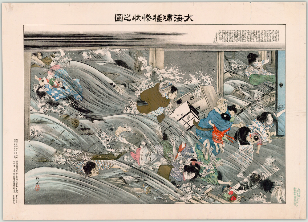
Source here: https://www.flickr.com/photos/ubclibrary_digicentre/13720269294/
Isn't that just terrific?
I don't read Japanese; drop me a line if you care to translate any of the language. I'll add the translations here.
]]>"The Cyber Risk Summit brings together cyber security specialists, technologists, entrepreneurs, industry experts and business leaders to tackle the challenges and opportunities that come with cyber security strategies. Featuring break out sessions keyed in for your needs connecting with peers and strategic insights, this is a day you can't afford to miss.
Attendees from Human Resources, Accounting, and Legal departments can receive continuing education credit for attending and following a discipline specific curriculum."
If you're in Washington State or B.C., you'll want to be here. This is cutting-edge stuff, and the indefatigable TAG org has pulled in a who's-who of speakers. Mark R. Anderson (SNS), in person - I'd drive across the state to hear him talk, any day. Mark Wallach of the FBI, Michael Cockrill of Office of the CIO for Washington State - zowie!
We explained some really arcane cybersecurity stuff a few years ago - bringing topics that abstract to life is very challenging. I'm the caboose for the day, trying to summarize on the fly.
It's going to be intense and interesting - and probably a bit unnerving. See ya there.
--Matthew
]]>"A white paper is a persuasive essay sponsored as a piece of marketing content by an organization. - See more at: http://www.thatwhitepaperguy.com/white-paper-faq.html#sthash.F4oHeZ7f.dpuf"
I was amused to see what the white paper expert had to say about white papers.
- Who publishes white papers? "Any B2B vendor selling anything relatively new, relatively complex or relatively expensive could likely benefit from a white paper."
- Who reads them? "White papers are read by almost anyone contemplating the purchase of a relatively new, relatively complex, or relatively high-priced product or service for their business."
- How do people read white papers? "...they tend to skim, scan and skip... especially if they're reading off the screen. Don't you?"
- How much does a white paper cost? "In 2005, executives from the white paper syndicates told me that medium-sized technology firms can expect to spend $3,000 to $5,000 to have a white paper written and illustrated. Five years later, that still sounds close to the ballpark...At the high end...$5,000 - $10,000."
- How long does a white paper take? "In my experience, after working on more than 100 white papers, it takes 6 to 8 weeks to get from the first interview to an approved white paper draft." Seriously? I could kiss the screen. Yes, it takes time to be clear!
There are topics where white papers - in other words, language - is better-suited to the job than the mix of visual communication, narrative and language that goes into explanation video. Yeah, surprise - I really don't think video is the right tool for every job!
That being said, in most cases, video is a better tool for many of the business goals and subjects traditionally addressed with white papers:
I quote the white paper guy at some length:
"Why do companies do white papers?
In general, vendors publish white papers for two main reasons: either to gather leads, or to stake out a position as a leader in their market space.
According to one study, vendors publish white papers for all these reasons:
- Gather leads for the sales force
- Educate potential customers
- Influence a selection committee
- Educate the sales force or channel partners
- Educate the media
- Send to a trade publication or website
- Redefine a market space
- Build credibility or mind share
- Keep up with competitors that have white papers.
On a strategic level, white papers fit into the widespread trend of "marketing with content."
All things being equal, I'd bet the house on a well-crafted explanation video bringing 5-10x the ROI against these goals, over a white paper. It's partially math. White papers tend to be about 2,500 words long. Forrester's Dr. James McQuivey is frequently quoted by the video folks for having said that 1 minute of video conveys as much information as 1.8 million words.
It's also behavior. I've looked at the detailed viewing data on (literally) thousands of explanation videos. People don't tend to skim/scan/skip. For the most part, they watch, then they stop. They may stop before the end, but they don't skim/scan/skip very much. It's in the nature of the form (chronological medium).
If you want a white paper, go see ThatWhitePaperGuy. He clearly knows what he's doing. Give us a call to talk video though. (888) 618-9088.
carpe diem
Matthew

Think about this one for a sec.
You think they shot & edited that video, about video-making with an iPhone, on an iPhone?
I don't know the answer, just struck by the possible irony.
]]>
Note the light-handed branding approach, too. They don't pound on & on about IBM selling ninja polymers. It's there, but it's handled factually. (Explanation ≠ commercial!)
The comments on YouTube are interesting. Some gripe about dumbing down the subject, others say it really engaged them. The view counter tells the real tale, though - about 29,000 views within two weeks. Technical, dense explanations don't get that kind of traffic.
Really nice work, on many levels.
--md
]]>Ask yourself this, if you're over 30. Has your reading changed? I don't mean what you read - that, certainly - but HOW you read. My sense is that I skim & scan much, much more than I used to. (And "avid reader" doesn't begin to describe my appetite for reading.)
The issue isn't reading and reading habits - it's coping. Here's the problem, in a visual of course:
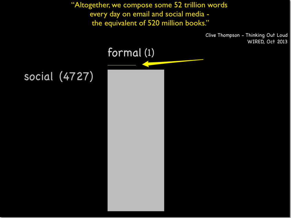
The Library of Congress adds about 11,000 volumes per day - total to date, 32 million.
Clive's estimate is the equivalent of 520 million books.
Result: 4,727-to-1.
What we used to think of as formal knowledge - the stuff that goes in library - is outweighed thousands-fold by the social stuff. But wait, it gets more interesting.
LOC has 32 million volumes. Founded in 1815 - 198 years ago. Multiply by 365 to get 442 volumes per day, on average. But the current rate is 11,000 per day. Has the rate of acquisition of formal knowledge gone up? Sure - dramatically.
I think we're creating a problem that we're not quite culturally ready to 'fess up to (except Ray Kurzweil & his fans.) Overload? The word doesn't really capture the issue, does it. It has a sense of voluntary taking-on-a-bit-much, with a smidge of pride. We're not "overloaded" - we are incapable of handling this much information in the ways we've handled information for the past 500 years or so.
If you deal with information and knowledge in your profession, you're rightfully proud of both the knowledge you've got, and your skill at adding to it. Saying "I can't keep up" doesn't really square with that very easily. Honestly, though - you're not "keeping up." I'm not "keeping up."
The techno-centric response is to point at the knowledge tools we've added - search engines, software, "big data" tools, blah blah blah. No argument from me, take away my browser and suddenly I'm not half the borg I used to be. But I don't think my capacity for knowledge acquisition - for adding to what I know and associating it with what I knew - is 4,000 times greater than Grandpa had. It's probably the same; Jared Diamond says something to that effect in Guns, Germs & Steel as I recall - the guy whose life depends on plants and grass can make a huge number of distinctions, where an idiot like me just sees grass.
Is this a waste of time in the face of the bitflood? Yes - and no. One of the reasons I like working with visual and narrative communication is that it often works when words don't. It's not a panacea - I don't know about you, but I've started to "read" infographics with the same impatient handling reserved for email. But it's at least an attempt to reframe communication challenges in light of this big contextual overload issue.
The rise of "design" strikes me as a response to all this, in a sense. That's another post. I have stuff to read ;-)
--md
]]>The same project for the client-who-must-not-be-named continues. They LOVE heat maps. Every data set, they want a heat map. I've said over and over that it's only relevant when we're making a consistent single comparison, but OK, you wanna heatmap...
I was looking at a very high-level summary, showing pricing across 8 product lines, with 30 varying tiers, for 6 different regions. (mumble mumble 30 x 6 = 180). You wanna heatmap, we gotta heatmap (Select Range - Conditional Formatting - Color Scales). I suggest clicking that to see a larger version.
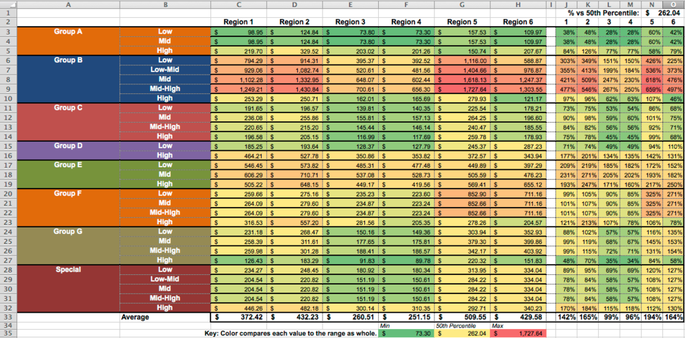
There are really two heatmaps here - the pricing in C:H, and a mirrored % set in J:O. Just look at the macro-level color pattern - identical, right?
It bugged me a bit, though, because the range is just nuts - from $73.30 to $1,767.24. Lots of stuff in the yellow middle. It bugged me because the groups aren't necessarily interchangable, where the tiers might be.
So I tried something a little more elaborate:
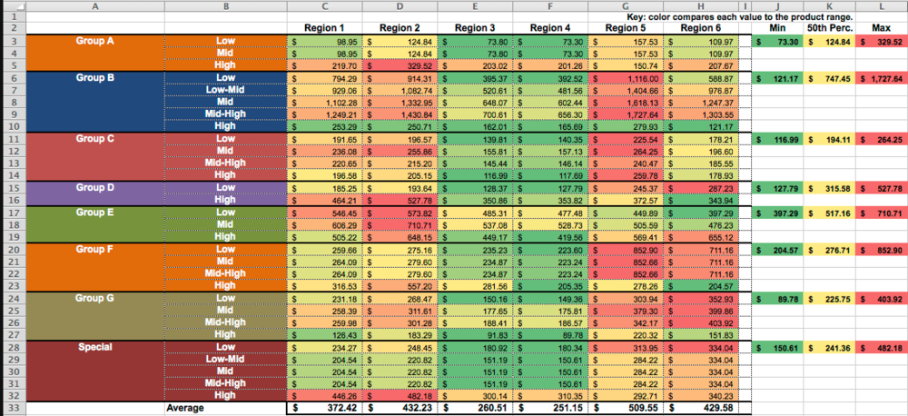
The punchline here, in terms of visual communication, is that this is the same data. If you can, look back and forth at the small versions of these pictures. It's a really different pattern. Wow, those Region 3 & Region 4 guys are good (green). What the heck is going on with Group E in Region 2, and Group F in Region 5. And so on, and so on.
My contention is, there's no way in heck to spot those comparisons by looking at the numbers. It's just not going to happen. Your brain isn't going to hang on to the relationships between 180 different numbers.
OK - quickly - HOW this was done with Conditional Formatting rules. First one - the whole range is a single comparison ("Rule"):
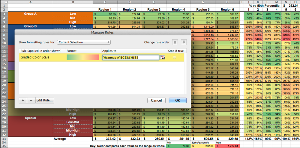
To make the second one - group-by-group - required selecting just the range for a group (e.g. C3:H3 for the first group), and applying conditional formatting for that range. Lather, rinse, repeat.
You can see the list of separate rules here:
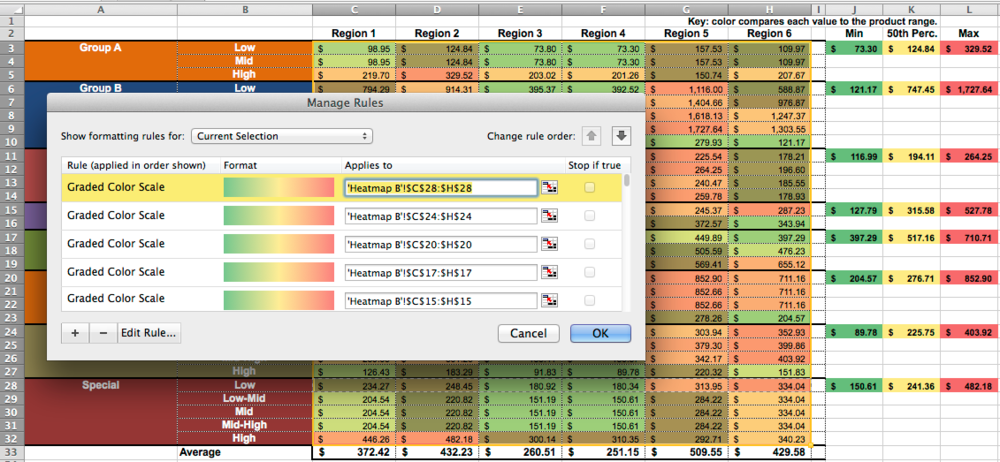
Now, I suppose we could have an interesting argument about whether this is a good approach. The color-coding between Groups is not absolutely consistent. $300 may come up RED in one group, and GREEN in another, and you aren't going to spot the really high prices for the set as a whole, or have a sense for which region or group is relatively low-priced or relatively high-priced.
Well...yeah, that's why we did both heat maps, but let's leave that aside for a moment.
The visual-communications question decision/question should be, does one of these color-coding approaches reveal more meaning in the data? I think the second one does.
It's pretty simple - axiomatic, even. Because we used additional structure in the data (the Group blocks), we revealed more about the data. The one-big-block heatmap didn't access that structure, so of course it had nothing to say (visually) about that dimension of the data.
FWIW I wouldn't have used the color-coding for the different groups (Columns A:B). It detracts from the meaningful color-coding of the data. Others' presentation decisions went into that choice. Oh well.
One non-obvious note - spending a little time getting consistent-sized columns, and finessing the gridlines, helps make this a more accurate mechanism for communication.
--md
PS auto-correct wants "heatmap" to be "heat map." I don't buy it. Thoughts?
]]>ทรูมูฟ เอช เชื่อเสมอว่า "การให้ คือการสื่อสารที่ดีที่สุด" โดยเราสื่อสารผ่านภาพยนตร์โฆษณาทางโทรทัศน์ เรื่องราวในภาพยนตร์โฆษณาเรื่องนี้ สะท้อนแนวคิดของแบรนด์ ทรูมูฟ เอช ที่เชื่อว่า...การให้โดยไม่หวังผลตอบแทนเป็นจุดเริ่มต้นของการให้ที่แท้จริง ทั้งนี้เค้าโครงเรื่องได้รับแรงบัลดาลใจ มาจากเรื่องราวทางสื่อสังคมออนไลน์ เล่าถึงเรื่องราวของการให้ที่ไม่หวังผลตอบแทน แต่ได้รับบางสิ่งตอบแทนราวปาฏิหาริย์ เพราะการให้คือ คือการสื่อสารที่ดีที่สุด แม้ไม่มีคำพูดสักคำ แต่กลับเป็นการสื่อสารที่ทรงพลังที่สุด ทรูมูฟ เอช เชื่อในพลังของการให้โดยไม่หวังผลตอบแทน และจึงมุ่งมั่นที่จะพัฒนาเทคโนโลยีการสื่อสารใหม่ๆ ให้กับคนไทย เพื่อสร้างโอกาสและพัฒนาคุณภาพชีวิตคนไทย ให้ทุกๆการสื่อสาร เชื่อมต่อถึงกันอย่างไม่มีที่สิ้นสุด ชีวิตอิสระ ชีวิตทรูมูฟ เอช
Did you follow this?
Me too.
I don't speak Thai either.
Doesn't matter, does it.
"A fellow-feeling makes one wondrous kind."
David Garrick: Prologue written for his last performance, June 10, 1776.
--md
]]>
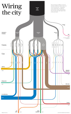
What makes it terrific? Sounds dumb, but the fact that it's so easy to follow and understand. Line thickness means something, color means something, and connection/path/destination mean something - and comparing between them is so easy it's unconscious.
Imagine a written report on energy use in Hong Kong. Think it would fit on a single page, or (more likely) 50-100 pages of prose with a few number tables.
Imagine a group faced with deciding energy policy, or rates, or infrastructure. Would having this diagram on the table or the wall help them make better, faster decisions? Would the diagram be regarded as more or less "serious and substantive" as the hypothetical report? Is that an accurate reflection of value, or a cultural bias?
A client recently rejected a set of Sankey diagrams we'd worked up because they were "too curvy." Methinks that was more about their culture than the curves, but you can't please all of the people all of the time. Come to think of it, that proverb would make a good Sankey diagram :-)
--md
]]>Here are the facts, ma'am.
- In the last 3 years, cell phone traffic has increased 5000%
- Mobile ad spending was expected to grow 80% in 2012 and reach $2.6 Billion.
- Mobile traffic is expected to increase 18 fold by 2016.
- By 2014 there will be more mobile users than desktop and laptop users globally.
- 50% of smartphone users watch video on their mobile device.
- 75% of US smartphone owners watch video on their smartphones, and 26% do so every day.
- 92% of mobile video viewers share videos with others.
- Online videos account for half of all mobile traffic.
Is it "cell phone" or "mobile" or "smartphone" ? Oh, wait - if you pull a bunch of random stats from other people and attribute them (however illegibly), you're not supposed to monkey with their choice of terms.
Do I care what was expected in 2012, now that we're in 2013? Seriously? You can't be bothered to find the most recent data, or projections into the future.?
Then there's smartphone video viewing. Rossiter says 50%, Google says 75%. Are we supposed to pick which one to believe?
Leaving those citation nits aside, it's just the sheer waste of space and time that irks me about this. 8 sparse bullets become a longform-scrolling blue nightmare. No comparison or relationship between data. No insights. Just the Smurfs edition of Illustrator coughing up random decoration and whitespace. Tell me, please, why this is better. I don't see it. Grrr!
Dear clients - if we ever do something this ineffectual, please show us the door.
--md
 ]]>
]]>Is your company represented on YouTube? If 1 out of 2 people on the Internet are on YouTube...maybe you should consider doing something.
--md
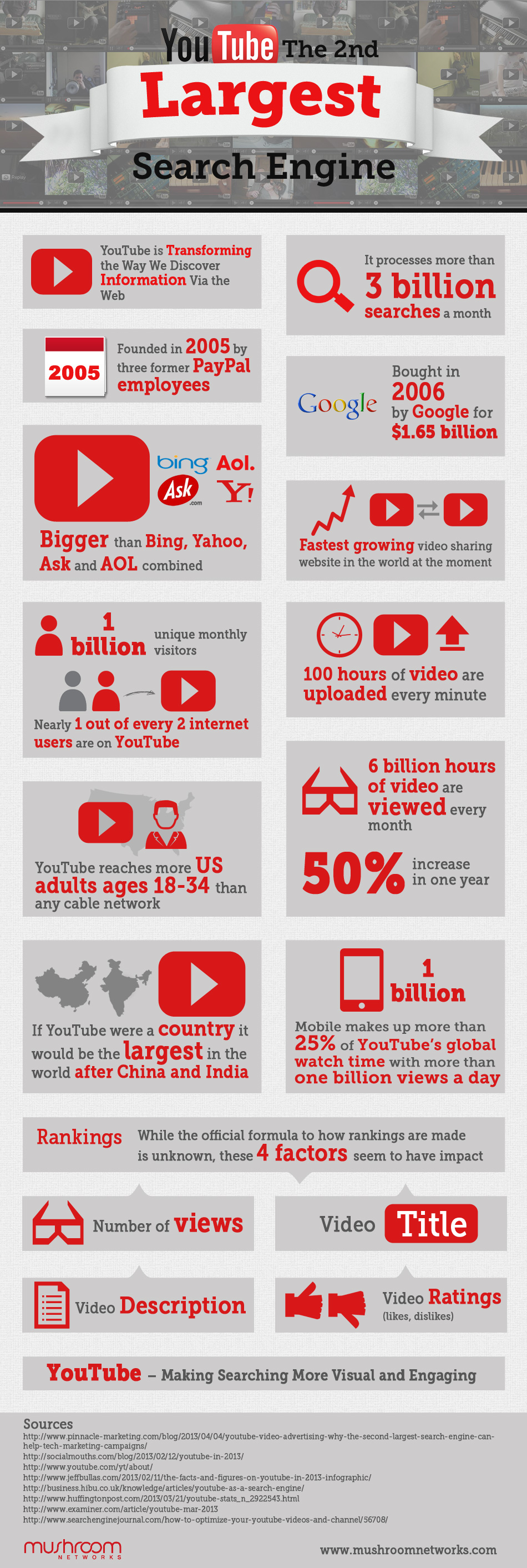
Infographic by Mushroom Networks
One nearly-unconscious rule for me in explaining is, as the title says, "make the big things big." By that I mean, simply make the most important things the most visible/memorable elements in your communication. Measure them. Color them. Check their font size. If they're not the biggest (or most saturated, or most-contrasted, or most 'foreground') things on the screen, there should be a VERY good reason.
As an avid fly fisherman, I was delighted to run across this series of river maps which depict major North American river systems using the conventions of transit system visuals (established with the original London Underground map by Harry Beck).
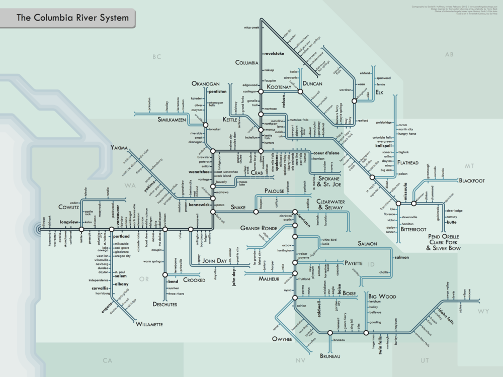
Columbia River System by http://cargocollective.com/somethingaboutmaps
Click that and enjoy it. Then try to pick out river relationships in this, which is roughly the same set of watersheds.
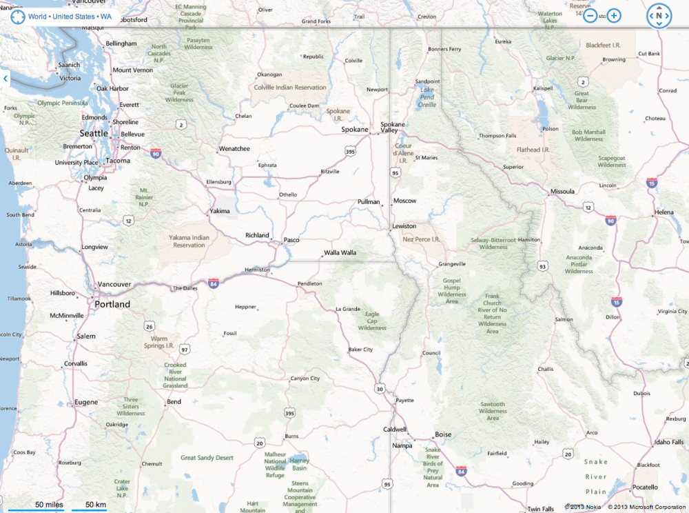
Bing map view http://binged.it/16pOqRF
Yes, the Bing map is depicting a broader set of entities. The goals are different, so the design choices are different. That's the point, right? (FWIW, I found the Bing design better than Google's design at helping me see rivers.)
The Cargo Collective river transit maps take the 'big things big' further. They sacrifice things like state geographies and terrain elevations to make the structural relationships of the rivers clear.
I was once on a stream above the Okanogan river - near "Omak" on the transit map, doing some early-morning teasing for trout. I about dropped the rod when I saw a massive fish - at least two feet long - shoot up the pool and past me. It was most likely a steelhead (an anadramous trout - one that ran off to sea, returning with tattoos and a procreative imperative). The truly startling thing was how FAST the fish moved.
Trace from Omak to the Pacific on the transit map, and envision what that fish went through to be back on that stream - with enough energy left to go like a torpedo. Marvelous! (And pretty marvelous that a simple-looking map could give you the framework for that mental narrative, which is a whole other point to be made later.)
Maybe it's time to go fishing. Keep the big things big.
--md
]]>
One of the pitched battles that I lost came to mind when I ran across this very cool "Units of Measure" poster. (Yeah, I want this hanging on the office wall!)
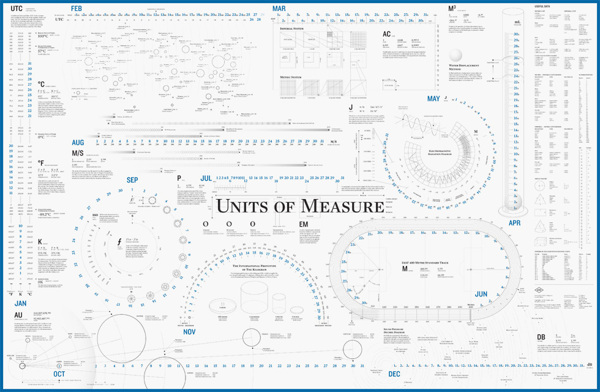
The battle was over blood pressure measurements.
Do you know your most recent BP measurements? Hint, it's one number over another number. Honestly, I couldn't remember mine when we got to that topic - other than "good."
Do you know what each measure represents? Here's a handy explanation video that (we hope) makes that more memorable.

The unit of measure for blood pressure is millimeters of mercury. No, we don't tend to have mercury getting pushed up a glass tube any more, but the digital readout on your blood pressure monitor is using the same terms.
What I argued - unsuccessfully - was that the measures are arbitrary, and (consequently) difficult to understand. Systolic ranges from 90 to 180, diastolic from 60 to 110; systolic above 140 is BAD, diastolic above 90 is BAD. Argh! I know it's just a few numbers, I know it's important, but even a simple table of those numbers just doesn't stick. My proposed solution - combine the numbers and try to make that one combined number stick in people's heads. Combined measure of bad is 230.
If you watch the video, you'll see the time for the surprise party is 2:30. We had a line in the voiceover, something like "If it's past 2:30, it's time to see your doctor!" The health experts argued that the BP system of measure is too well-established and too well-understood. They were the client, OK, we won't talk about combined measures.
I still don't agree. I remembered 2:30 but I had to go look up the stupid arbitrary number ranges to write this post! :-)
Something as simple as a unit of measure has a powerful long-term effect - the story about horse's asses and the space shuttle is worth looking up. I hope that over time we'll be more deliberate about selecting new measures with a bias toward learnability and recollection - "human-scaling" them, if you will. If you're defining measures for a business, include "can anyone understand these and/or remember them" in your set of criteria.
Is that minutia? I don't think so. In the case of health literacy, it really is life-or-death important. When we're making decisions, the things we know & understand are going to trump the answers we could get from search engines - at least, I'd like to think that's the case. It's certainly the bias we bring to our work.
Enough. Go check your blood pressure! If it's past 2:30...
--md
]]>